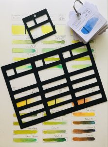
I am a painter who uses different kind of media, and one of them is watercolor. I also know the importance of having a good idea of the correct hue needed for a specific painting or project. I started collecting swatches to create an inventory of the colors that I have; this is helpful so that I don’t buy the same color again and also to compare colors and make mixes.
Swatching colors is fun but I didn’t greatly enjoy hand-drawing squares and rectangles so that I could add the information and the color sample. Soon, I created my own templates and decided to make them digital so I can print them as many times as I need them. These are in a .PNG format.
The need to print more templates, and also to have different sizes of templates, gave me the idea to cut these templates and reuse them just by tracing them to my paper.
Then, I designed more digital templates that I could also cut into stencils, using a digital cutter and thick card stock. These are in .SVG and .STUDIO formats.
I decided to design different sizes of templates:
The smallest are 2 by 2 inches. The biggest ones are 7 by 5 inches.
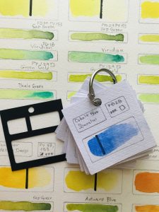
The 2 by 2 inches are very portable since I just add a metal ring and hang them for a quick reference. I like to use a 2 inch square punch with watercolor paper and draw with pencil. This stencil has spaces to add color information like the following:
- Color Name (Example: Ultramarine Blue)
- Manufacturer (Example: Daniel Smith)
- Color Pigment Number (Example: PB29 for Ultramarine Blue)
- Rating: Usually, manufacturers include this information somewhere within the packaging label of the product using stars from 0 stars to 5 stars for the best rating.
- Lightfastness: This is another way manufacturers refer to the permanency of the pigment. You can find it in different formats. The most common ranges from I being Excellent (the most durable) to IV being fugitive. Also, you can find this rating in letters from AA, Extremely Permanent to C, Fugitive.
- Series Number: Some manufacturers include this information; the higher the number the more expensive the paint is.
- Opacity: The transparency rating ranges from transparent to semi-transparent to opaque. This is represented with a small square.
- Staining: This is represented with a small triangle. When the triangle is filled inside, it means the paint is staining; semi staining is a half filled triangle and no staining is a blank triangle.
- Gradient Color Wash: Starting from the left with all the color strength and diluting it with water as I paint to the right
Before I paint the gradient color wash, I add a vertical line in that rectangle using a thick Sharpie marker. This will help to confirm the transparency of the paint.
At the back of the square, I apply more of the same paint and perform a Lifting Test, first with the paint still wet in one area of the swatch and once the paint is dry on another side of the swatch to confirm how staining is the paint. If the paint is a granulating color, I add a G to the swatch.
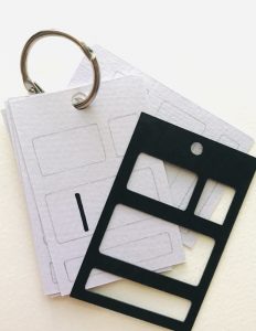
With the bigger sizes, I was able to record the information from the smaller template, plus I have more spaces to add color mixes, etc. All of the templates have 2 options: one design with a hole to add a metal ring and another without a hole.
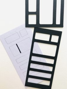
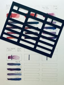
Although I have used these templates for watercolors, you can use them for any type of color media–such as acrylics or oils.
If you would like to get more information about this collection of templates for cutting by hand or using a digital cutting machine, here is the link: